With over nine years of experience, I design creative web solutions that drive growth and innovation for businesses worldwide. My focus is on building high-performance websites that are tailored to solve real-world challenges efficiently. Let’s bring your vision to life!
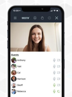
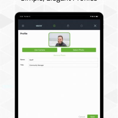
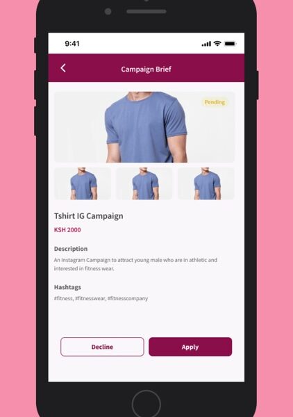
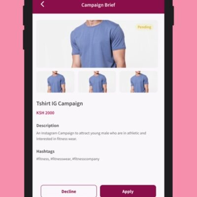
Whizlancer developed the entire MEETN platform, a comprehensive solution designed to facilitate online meetings and collaboration. Our platform includes features such as high-definition video conferencing, real-time chats, screen sharing, and collaborative document editing, ensuring a seamless and productivity virtual meeting experience.
Strategy
The strategy at Whizlancer is centered around creating a seamless and highly productive virtual meeting experience.
Design
The design approach at Whizlancer focuses on creating visually appealing and functional user interfaces that align with the goals of the MEETN platform. Through a strong emphasis on UI/UX design and art direction.
User Experience
Whizlancer prioritizes delivering an exceptional user experience on the MEETN platform by focusing on the needs and expectations of its users. The UX design process ensures that every aspect of the high-definition video conferencing.
Toxic companies are usually characterized by huge debt loads and are vulnerable to external shocks. Accurately identifying such bloated stocks and getting rid of them at the right time can protect your portfolio.
Toxic companies are often identified by their high debt loads, making them vulnerable to external economic shocks. Such companies may also have overpriced stocks, driven by irrational market enthusiasm or severe fundamental weaknesses. Holding onto these stocks for too long can result in significant wealth erosion..
However, if you can precisely spot such toxic stocks, you may gain by resorting to an investing strategy called short selling. This strategy allows one to sell a stock first and then buy it when the price falls.
While short selling excels in bear markets, it typically loses money in bull markets.
The plat is built with scalability and security in mind, providing robust encryption and user authentication measures. by delivering this all-in-one meeting and collaboration solution, MEETN enables businesses and individual to connect and collaborate effectively, regardless of their location, thus enhancing productivity and communication.
Here is a winning strategy that will help you to identify overhyped toxic stocks:
Identify toxic stocks early based on financial metrics such as Debt/Equity Ratio. A ratio higher than the industry median suggests high leverage and increased repayment obligations.
Whizlancer developed a comprehensive e- commerce platform for Twiva, facilitating seamless online shopping and business transactions. Our solution include a user-friendly interface, secure payment gateways, and robust inventory management tools, catering to both buyer and seller..
Strategy
The strategy behind Twiva’s mobile and web development is to create a seamless e-commerce experience for users by combining innovative technology with user-centric design. Whizlancer’s comprehensive approach ensures that Twiva meets long-term business goals by focusing on secure payment
Design
Twiva’s design philosophy is rooted in UI/UX excellence, prioritizing aesthetic appeal and functionality. By crafting designs that are visually engaging and intuitively navigable, Twiva ensures users can easily browse, shop, and transact.
User Experience
The user experience on Twiva’s platform is designed to simplify and enhance online shopping and business interactions. From easy navigation to secure transactions, every aspect of the UX is thoughtfully developed to ensure customer satisfaction and trust..
Toxic companies are usually characterized by huge debt loads and are vulnerable to external shocks. Accurately identifying such bloated stocks and getting rid of them at the right time can protect your portfolio.
Highlight how Whizlancer’s expertise enabled Twiva to offer features like real-time inventory updates, secure payment integrations, and personalized user dashboards.
However, if you can precisely spot such toxic stocks, you may gain by resorting to an investing strategy called short selling. This strategy allows one to sell a stock first and then buy it when the price falls.
While short selling excels in bear markets, it typically loses money in bull markets.
So, just like identifying stocks with growth potential, pinpointing toxic stocks and offloading them at the right time is crucial to guard one’s portfolio from big losses or make profits by short selling them. Explore how Twiva’s platform is designed to scale effortlessly, accommodating growing user demand and expanding product catalogs.
Here is a winning strategy that will help you to identify overhyped toxic stocks:
Most recent Debt/Equity Ratio greater than the median industry average: High debt/equity ratio implies high leverage. High leverage indicates a huge level of repayment Explain how Twiva uses analytics tools to track user behavior, sales trends, and platform performance, helping businesses optimize their strategies. that the company has to make in connection with the debt amount.
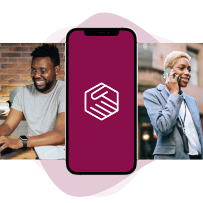
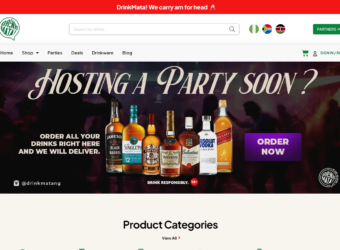
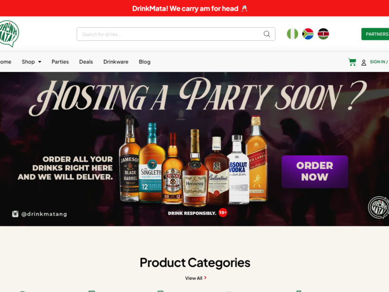
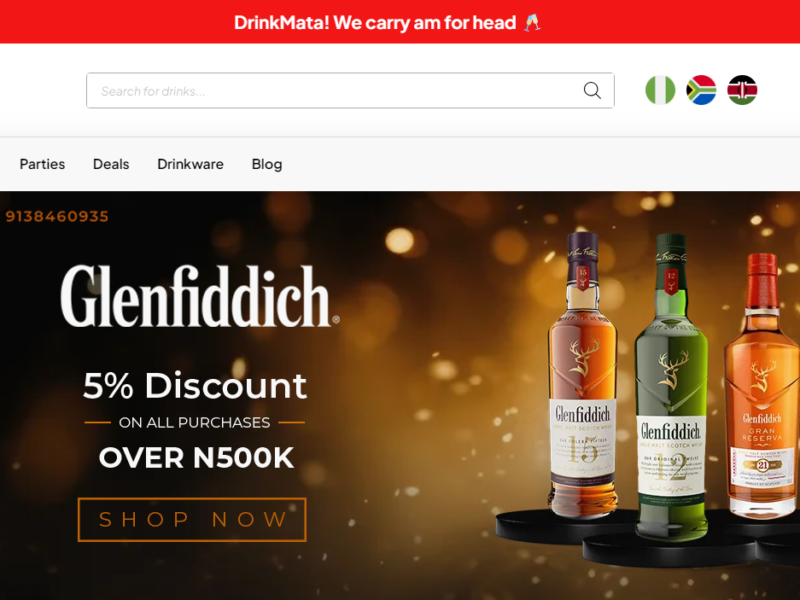
Whizlancer developed a website for Drink Mata, an online platform for ordering a wide variety of beverages. Our solution features a seek, user-friendly interface that allows customers to browse and order their favorite drinks effortlessly.
Strategy
The strategy behind this WordPress development project revolved around leveraging Whizlancer’s expertise to build a scalable and performance-optimized website. The goal was to provide a digital platform that enhances Drink Mata’s online
Design
The design approach focused on delivering an aesthetically pleasing yet functional layout. Whizlancer’s design team ensured that the website aligns with Drink Mata’s branding, incorporates vibrant visuals, and enhances user interaction through seamless UI/UX principles.
User Experience
User experience was a top priority in this project. Features like fast-loading pages, mobile responsiveness, and a visually coherent layout ensure visitors can interact with the platform effortlessly. The result is a website that not only looks professional but also provides a frictionless user journey.
The website includes advance search and filtering options, secure payment gateways, and real time order tracking to enhance the user experience. Built with modern web technologies, the platform has high performance, scalability, and security.
By leveraging this comprehensive website, Drink Mata can streamline its operations, improve customers satisfaction, and extent its reach in the beverage market.
However, if you can precisely spot such toxic stocks, you may gain by resorting to an investing strategy called short selling. This strategy allows one to sell a stock first and then buy it when the price falls.
While short selling excels in bear markets, it typically loses money in bull markets.
So, just like The Drink Mata WordPress development showcases Whizlancer’s ability to deliver custom web solutions that align with client goals. This project is a testament to Whizlancer’s expertise in combining creativity and technology to build impactful digital experiences.
Here is a winning strategy that will help you to identify overhyped toxic stocks:
Most recent Debt/Equity Ratio greater than the median industry average: High debt/equity ratio implies high leverage. High leverage indicates a huge level of repayment that the company has to make in connection with the debt amount.
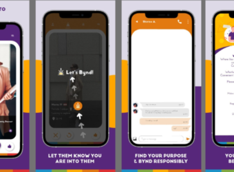
Whizlancer developed a complete social media platform designed to connect user in a dynamic and interactive online environment . Our solution include robust features such as user profiles, friend connections, real-time messaging, multimedia sharing, and community groups.
Strategy
The development strategy for BYNDR focused on delivering a scalable, cost-efficient, and performance-optimized application. By choosing Flutter, Whizlancer ensured the app would be future-proof and capable of adapting to evolving user needs and business requirements.
Design
Whizlancer’s design team incorporated a modern, minimalist design philosophy for the BYNDR app. The visual aesthetics were crafted to reflect the brand’s identity, while the functional elements were tailored for an intuitive and enjoyable user experience.
User Experience
Whizlancer’s design team incorporated a modern, minimalist design philosophy for the BYNDR app. The visual aesthetics were crafted to reflect the brand’s identity, while the functional elements were tailored for an intuitive and enjoyable user experience.
The platform is built with scalability and security in mind, ensuring a seamless user experience even as the user base grows, By incorporating advanced algorithms for content recommendations and user engagement analytics.
Overpricing of these Byndr offers a personalized and engaging social media experience, fostering community building and meaningful interactions.
Whizlancer’s design team incorporated a modern, minimalist design philosophy for the BYNDR app. The visual aesthetics were crafted to reflect the brand’s identity, while the functional elements were tailored for an intuitive and enjoyable user experience.
While short selling excels in bear markets, it typically loses money in bull markets.
So, The BYNDR Flutter application was designed to provide users with a seamless and efficient mobile experience. By leveraging Flutter’s cross-platform capabilities, Whizlancer ensured the app operates flawlessly on both iOS and Android devices, reducing development costs while maintaining performance and quality.
Here is a winning strategy that will help you to identify overhyped toxic stocks:
Most recent Debt/Equity Ratio greater than the median industry average: High debt/equity ratio implies high leverage. High leverage indicates a huge level of repayment that the company has to make in connection with the debt amount.
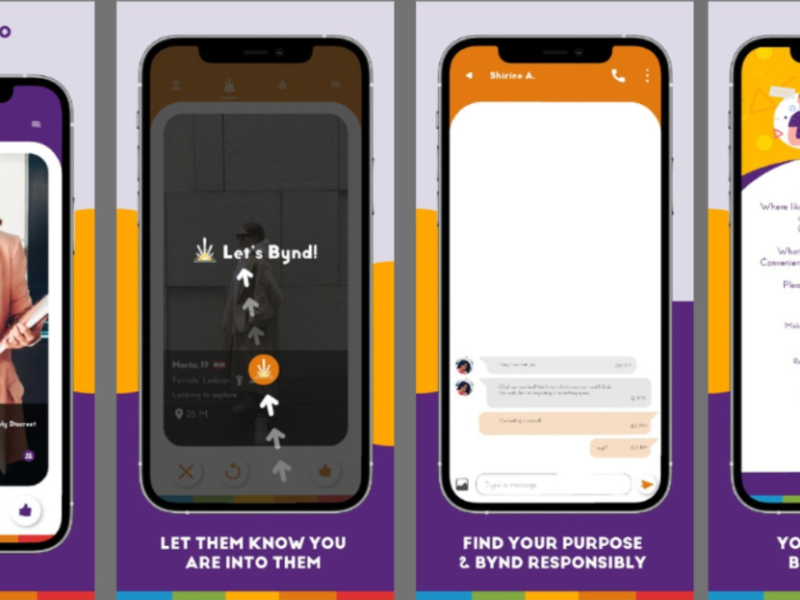
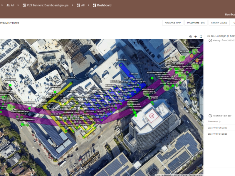
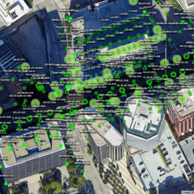
Whizlancer developed the entire SaaS platform, a specialized solution tailored for metro line construction projects, including tracks, tunnels, and stations. Our platform provides real-time project monitoring in aspect of safety. It includes feature like detailed project dashboard, automated reporting, and collaboration tools, ensuring efficient communication and coordination among stakeholders.
Strategy
Whizlancer’s strategy for the IoT-based Real-time Data Management system for Terrastamp is focused on creating a solution that not only supports current needs but also adapts to future demands. The goal is to provide ASC Engineering with a comprehensive platform that can streamline their operations, improve decision-making
Design
The design of this system incorporates UI/UX design principles to ensure that users have an intuitive and engaging experience while interacting with the platform. The focus is on providing a clean, easy-to-navigate interface that presents data
User Experience
The user experience for this project is centered around creating a seamless and intuitive flow of interactions. Key features of the UX include ”Real-Time Projects ,”Customizable Dashboards”.
The IoT-based Real-time Data Management solution for Terrastamp by Whizlancer is a game-changer in how ASC Engineering will manage its operations.
With real-time data insights, predictive analytics, and automated processes, the platform will greatly enhance operational efficiency, reduce downtime, and improve overall asset management.
However, if you can precisely spot such toxic stocks, you may gain by resorting to an investing strategy called short selling. This strategy allows one to sell a stock first and then buy it when the price falls.
While short selling excels in bear markets, it typically loses money in bull markets.
So, The project showcases Whizlancer’s expertise in developing cutting-edge solutions that combine IoT technology with intelligent data management .Whizlancer’s ongoing development of IoT-based real-time data management for Terrastamp aims to revolutionize how ASC Engineering monitors and controls their assets in real time. By leveraging the power of IoT devices and data analytics, this solution promises not only to enhance operational efficiency but also to ensure predictive maintenance and overall system health.
One of the defining aspects of the Terrastamp IoT solution is its scalability. As ASC Engineering continues to expand, the system can easily accommodate more IoT devices, sensors, and data points without affecting performance.
Most recent Debt/Equity Ratio greater than the median industry average: High debt/equity ratio implies high leverage. High leverage indicates a huge level of repayment that the company has to make in connection with the debt amount.
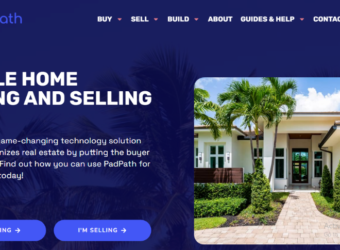
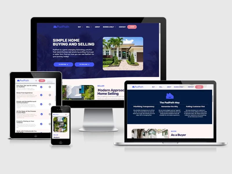
Whizlancer’s real estate website design for PadPath successfully meets the client’s goal of providing a user-friendly, visually appealing, and efficient platform for showcasing properties. By incorporating advanced search features, interactive maps, and a responsive layout, this project demonstrates Whizlancer’s expertise in crafting sophisticated web solutions
Strategy
The strategy behind the PadPath Real Estate Website was focused on creating an easy-to-navigate, highly functional platform that would attract both property seekers and sellers. The long-term goal was to build a digital space.
Design
The UI/UX design for the PadPath Real Estate Website was centered around ease of use, visual appeal, and a professional tone to build credibility with potential buyers and renters.
User Experience
Whizlancer placed a strong emphasis on user experience (UX) to ensure the website is intuitive and streamlined, providing a smooth journey from browsing properties to inquiring about them.
The platform includes features like saved property searches and personalized property suggestions, ensuring users feel their experience is tailored to their needs. The personalized dashboard helps returning customers keep track of their favorite properties and stay updated with new listings.
The design team at Whizlancer incorporated minimalistic aesthetics using neutral color tones to create a clean, organized appearance. Large, high-quality property images were featured prominently, providing a professional yet visually engaging platform.
However, The strategy behind PadPath Real Estate Website Design not only focused on attracting and converting visitors but also on building long-term relationships and maximizing user retention.
While short selling excels in bear markets, it typically loses money in bull markets.
So, The website is designed to include several lead capture forms throughout the user journey, from simple property inquiries to contact forms. CTA buttons like “Request More Info,” “Schedule a Viewing,” and “Get a Free Market Report” encourage users to engage with agents, generating high-quality leads for PadPath.
Here is a winning strategy that will help you to identify overhyped toxic stocks:
Dynamic Listing Pages: The property listing pages were designed to give users detailed information without overwhelming them. Each property features clear imagery, an interactive map, and property highlights such as price, number of bedrooms, square footage,
The India economy has grown strongly over recent years, having transformed itself from a producer and innovation-based economy.
Features
Design Skill
PHOTOSHOT
100%
FIGMA
95%
ADOBE XD.
60%
ADOBE ILLUSTRATOR
70%
DESIGN
90%
Features
Development Skill
HTML
100%
CSS
95%
JAVASCRIPT
60%
SOFTWARE
70%
PLUGIN
90%
2010 - 2022
Job Experience
Sr. Software Engineer
Google Out Tech - (2017 - Present)
USA
Google’s hiring process is an important part of our culture. Googlers care deeply about their teams and the people who make them up.
Web Developer & Trainer
Apple Developer Team - (2012 - 2016)
MALAYSIA
A popular destination with a growing number of highly qualified homegrown graduates, it's true that securing a role in Malaysia isn't easy.
Front-end Developer
Nike - (2020 - 2011)
INDIA
The India economy has grown strongly over recent years, having transformed itself from a producer and innovation-based economy.
2001 - 2020
Trainer Experience
Gym Instructor
Rainbow Gym Center (2015 - 2020)
DHAKA
The training provided by universities in order to prepare people to work in various sectors of the economy or areas of culture.
Web Developer and Instructor
SuperKing College (2010 - 2014)
CANADA
Higher education is tertiary education leading to award of an academic degree. Higher education, also called post-secondary education.
School Teacher
Kingstar Secondary School (2001 - 2010)
NEVADA
Secondary education or post-primary education covers two phases on the International Standard Classification of Education scale.
2007 - 2010
Company Experience
Personal Portfolio April Fools
University of DVI (1997 - 2001))
4.30/5
The education should be very interactual. Ut tincidunt est ac dolor aliquam sodales. Phasellus sed mauris hendrerit, laoreet sem in, lobortis mauris hendrerit ante.
Examples Of Personal Portfolio
University of DVI (1997 - 2001))
4.30/5
The education should be very interactual. Ut tincidunt est ac dolor aliquam sodales. Phasellus sed mauris hendrerit, laoreet sem in, lobortis mauris hendrerit ante.
Tips For Personal Portfolio
University of DVI (1997 - 2001))
4.30/5
The education should be very interactual. Ut tincidunt est ac dolor aliquam sodales. Phasellus sed mauris hendrerit, laoreet sem in, lobortis mauris hendrerit ante.
2007 - 2010
Job Experience
Personal Portfolio April Fools
University of DVI (1997 - 2001))
4.30/5
The education should be very interactual. Ut tincidunt est ac dolor aliquam sodales. Phasellus sed mauris hendrerit, laoreet sem in, lobortis mauris hendrerit ante.
Examples Of Personal Portfolio
University of DVI (1997 - 2001))
4.30/5
The education should be very interactual. Ut tincidunt est ac dolor aliquam sodales. Phasellus sed mauris hendrerit, laoreet sem in, lobortis mauris hendrerit ante.
Tips For Personal Portfolio
University of DVI (1997 - 2001))
4.30/5
The education should be very interactual. Ut tincidunt est ac dolor aliquam sodales. Phasellus sed mauris hendrerit, laoreet sem in, lobortis mauris hendrerit ante.
What Clients Say
Testimonial
Brian Reiff
Chief Operating Office
Android App Development
via Upwork - Mar 4, 2015 - Aug 30, 2021 test
Maecenas finibus nec sem ut imperdiet. Ut tincidunt est ac dolor aliquam
sodales. Phasellus sed mauris hendrerit, laoreet sem in, lobortis mauris
hendrerit ante. Ut tincidunt est ac dolor aliquam sodales phasellus smauris test
Rainbow-Themes
Cara Delevingne
Chief Operating Officer
Travel Mobile App Design.
via Upwork - Mar 4, 2015 - Aug 30, 2021 test
Maecenas finibus nec sem ut imperdiet. Ut tincidunt est ac dolor aliquam
sodales. Phasellus sed mauris hendrerit, laoreet sem in, lobortis mauris
hendrerit ante. Ut tincidunt est ac dolor aliquam sodales phasellus smauris test
Bound - Trolola
Jone Duone Joe
Operating Officer
Web App Development
Upwork - Mar 4, 2016 - Aug 30, 2021
Maecenas finibus nec sem ut imperdiet. Ut tincidunt est ac dolor aliquam
sodales. Phasellus sed mauris hendrerit, laoreet sem in, lobortis mauris
hendrerit ante. Ut tincidunt est ac dolor aliquam sodales phasellus smauris
The Art and Science of Web Design: Enhancing User Experience Through Psychology
the digital world, web design isn’t just about making websites look attractive. It’s a careful balance of art and science aimed at influencing user behavior, emotions, and actions. The best web designs don’t just catch the eye—they guide users, build trust, and create memorable experiences. And at the heart of this lies psychology. Understanding how users think, feel, and behave online can help designers craft websites that are intuitive, engaging, and conversion-focused.
In this blog, we’ll explore how the art and science of web design work together, using psychological principles to enhance user experience (UX) and ultimately drive better results.
The Intersection of Art and Science in Web Design
Art in web design refers to the creative and aesthetic elements that make a website visually appealing—things like colors, fonts, images, and layouts. On the other hand, science refers to the application of research, data, and psychological insights that inform how those artistic elements influence user behavior.
When these two components are combined effectively, they create websites that don’t just look good but work well, providing users with clear, enjoyable, and productive interactions. The scientific side of web design, grounded in psychological research, can help ensure that the artistic choices enhance usability and drive desired outcomes—whether that’s making a purchase, signing up for a newsletter, or simply engaging with content.
1. First Impressions Matter: The Psychology of Visual Appeal
When users land on a website, they make a snap judgment within the first few seconds. According to research, it takes only 50 milliseconds for users to form an opinion about a website. That’s why the initial visual appeal is so important. Psychological Insight: Humans are wired to process visual information quickly, and our brains are attracted to clean, organized designs. If a website feels cluttered or chaotic, users are likely to leave before they even explore the content. On the other hand, a visually appealing design—one that feels modern, organized, and easy to navigate—instantly establishes trust and encourages users to stick around.
To enhance the user experience, focus on creating clean layouts, strong visual hierarchy, and consistent design elements. Prioritize white space, high-quality images, and a balanced color scheme to create a welcoming and professional first impression.
2. The Power of Color: Psychological Triggers in Web Design
Color is more than just an aesthetic choice; it can significantly affect a user’s mood and behavior. Different colors evoke different emotions, and web designers use this to guide users toward desired actions
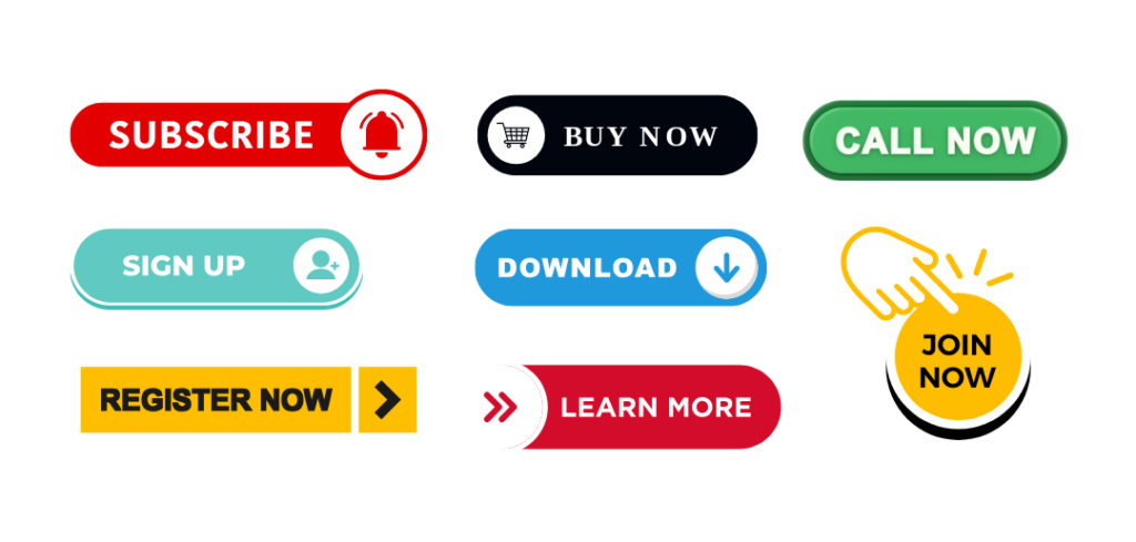
Psychological Insight: Colors have the power to influence decision-making and shape perceptions. For instance, blue is often associated with trust and reliability, which is why many banks and tech companies use it in their branding. Red, on the other hand, triggers urgency and excitement, making it ideal for call-to-action buttons like “Buy Now” or “Subscribe.”
Blue: Trust, security, calmness.
Red: Passion, urgency, excitement.
Green: Growth, health, tranquility.
Yellow: Optimism, energy, attention.
Black: Sophistication, elegance, luxury.
By choosing the right colors for your website based on the psychological responses they elicit, you can guide user behavior and enhance the overall experience.
3. Typography: More Than Just Choosing Fonts
Typography plays a critical role in web design. The fonts you choose can influence readability, emotional tone, and even how users perceive your brand. The psychology behind typography is about more than just choosing a “nice” font; it’s about ensuring the text communicates the right message and is easy for users to read.
Serif fonts (e.g., Times New Roman, Georgia) convey tradition, authority, and professionalism. These are often used by institutions that want to evoke trust, such as banks or law firms.
Sans-serif fonts (e.g., Arial, Helvetica) have a modern, clean, and approachable feel, making them ideal for tech startups or lifestyle brands.
Script fonts (e.g., Pacifico, Great Vibes) evoke elegance, creativity, and personality. These are often used by brands in creative industries or those aiming for a more casual, friendly tone.
Make sure your typography not only reflects your brand’s voice but also prioritizes legibility. Use appropriate line spacing, font size, and contrast to make text easy to read, especially on mobile devices.
4. Reducing Cognitive Load: The Science of Simplicity
Cognitive load refers to the mental effort required to process information. When a website is overwhelming—whether due to too many options, complex navigation, or dense text—users experience cognitive overload and are likely to leave.
Psychological Insight: Humans have limited cognitive resources, so websites that are easy to understand and navigate are more likely to keep users engaged. The simpler the design, the easier it is for users to focus on their tasks without feeling mentally drained.
Streamline navigation: Keep menus simple and intuitive. Avoid overwhelming users with too many choices.
Use clear CTAs: Make call-to-action buttons stand out, so users know exactly what to do next.
Break content into chunks: Long blocks of text are difficult to digest. Use headings, bullet points, and images to make content scannable.
By reducing cognitive load, you make it easier for users to achieve their goals on your website, which enhances overall satisfaction and engagement.
5. Building Trust: The Role of Visual Cues
Trust is a fundamental component of user experience. When users don’t trust a website, they’re less likely to interact with it, let alone make a purchase or sign up for a service. Trust cues help establish credibility and reassure users that they are safe and valued. Psychological Insight: Users are more likely to engage with a website if it feels secure and trustworthy. Visual cues, such as professional design, security badges, customer testimonials, and clear contact information, signal to users that your website is legitimate and reliable.
Trust cues include: .
SSL certificates (indicated by a padlock symbol in the browser)
User testimonials and reviews
Recognizable brand logos or certifications
Clear privacy policies and contact details
A website that exudes trustworthiness encourages users to take action, whether it’s filling out a contact form or completing a purchase.
6. User-Centered Design: Designing with Empathy
User-centered design is at the core of creating websites that resonate with users. It’s about understanding user needs, behaviors, and pain points to create experiences that are intuitive and effective. Psychological Insight: People are more likely to engage with websites that align with their mental models and expectations. By conducting user research, designers can gain insights into what users want and how they interact with digital content. This information helps designers create websites that are easy to navigate, meet users’ needs, and offer value. The empathy behind user-centered design ensures that users feel understood and supported throughout their experience on the website, leading to increased satisfaction and loyalty.
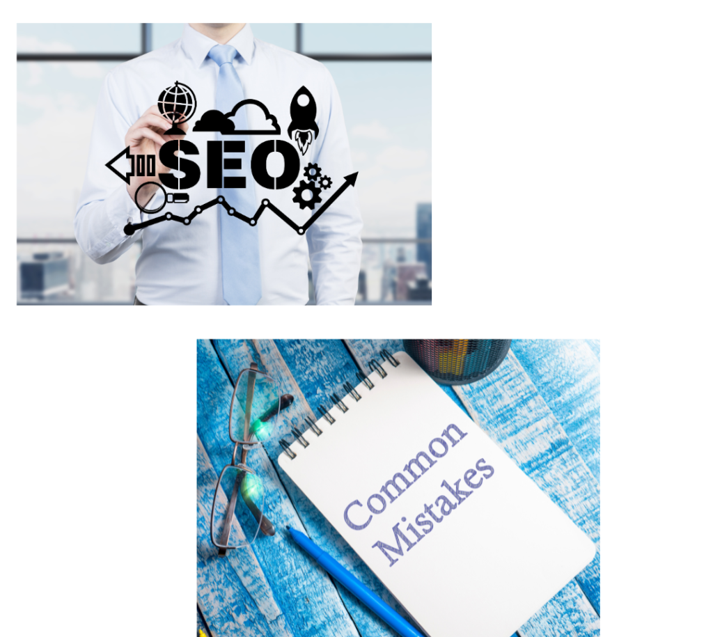
The Power of SEO-Friendly Web Design: Boosting Search Engine Visibility, Website Traffic, and Conversion Rates
—In today’s digital world, having a website isn’t enough for any business, brand, or individual. To attract organic traffic and grow your business your website must be SEO-friendly and optimized for both users and search engines. This is where SEO-friendly web design comes in. By integrating SEO principles into your web design, you ensure that search engines can easily crawl, index, and rank your site, while simultaneously providing users an exceptional experience.
In this blog post, we’ll dive into the importance of SEO-friendly web design and provide actionable tips to help you avoid common pitfalls, improve user experience, and increase your search engine rankings.
What is SEO-Friendly Web Design?
SEO-friendly web design means designing a website that is built with a focus on both user experience (UX) and search engine optimization (SEO). SEO-friendly web design that users can easily navigate your site, find relevant information, and have an engaging, seamless experience. In other words, it’s about designing your site in a way that makes it easy for search engines to index and rank your content and also makes it easy and enjoyable for users to navigate.
Why Does It Matter?
Think of it this way: You’ve built a gorgeous website, but if no one can find it, what’s the point? SEO ensures that your site is visible on Google’s first page, where 75% of users click! That means more traffic, more leads, and more business.
Key Elements of SEO-Friendly Web Design
To ensure that your website is optimized for both users and search engines, here are some important elements to focus on :
1. Responsive Design for Mobile Optimization
What it is: A responsive website design ensures that your site automatically adjusts to different screen sizes, from desktop to tablet to mobile. Why it matters: With mobile-first indexing, Google prioritizes the mobile version of your website for ranking. A mobile-friendly website is essential for higher rankings and better user engagement. SEO Tip: Use flexible layouts, scalable images, and media queries to ensure your site performs well on any device, improving mobile SEO.
2. Fast Load Page Speed for Better Rankings
What it is: Page speed refers to how fast your website’s content loads. Why it matters: Google considers page speed a ranking factor. Slow websites lead to high bounce rates which impacting negatively on your rankings and user experience. SEO Tip: Optimize images, minify CSS, and JavaScript, and enable browser caching to reduce load times and improve page speed for better SEO performance.
3. Navigating Easily to Reduce Bounce Rates
What it is: Easy-to-understand navigation helps users find information quickly. Why it matters: Clear website navigation enhances user experience and search engine crawling, it helps both users and search engines can easy to find important content. SEO Tip: Use descriptive headings, organized menus, and an intuitive structure to make your website easy to navigate and improve your SEO ranking.
4. Optimized Content for Higher Search Visibility
What it is: Content that is relevant, well-structured, and optimized with keywords for both users and search engines. Why it matters: Optimized content helps your website rank for targeted keywords and makes it easier for potential visitors to find your site. SEO Tip: Use targeted keywords naturally within titles, meta descriptions, headings, and body content to boost your website’s on-page SEO.
5. SEO-Friendly URL‘s
What it is: Clean, descriptive URLs that include relevant keywords. Why it matters: Well-structured URLs provide context to both users and search engines. Google uses URLs as part of its ranking algorithm. SEO Tip: Ensure URLs are short and descriptive, and include relevant keywords separated by hyphens for better SEO ranking.
6. Clear Calls-to-Action (CTAs) for Increased Conversions
What it is: Actionable buttons or links that prompt users to take desired actions, such as sign up or learn more. Why it matters: A clear call-to-action (CTA) directs visitors towards conversions, helping to boost conversion rates. SEO Tip: Use contrasting colors, strategic placement, and action-driven text to make your CTAs stand out.
7. HTTPS for Secure Browsing and Better Rankings
What it is: HTTPS is the secure version of HTTP, encrypting the data exchanged between users and your server. Why it matters: Google prioritizes HTTPS as a ranking signal. Secure websites inspire trust in users and can improve your SEO performance. SEO Tip: Install an SSL certificate to make your website secure (HTTPS) and improve SEO rankings.
8. Structured Data (Schema Markup) for Rich Snippets
What it is: Schema markup is code that helps search engines to understand the content of your site and enabling rich snippets in search results. Why it matters: Structured data enhances your website’s visibility in search results by displaying additional information like star ratings, product prices, or event details. SEO Tip: Implement schema markup for articles, products, and events to improve your SEO visibility.
9. Alt Text for Images to Improve Image SEO
What it is: Alt text describes an image, helping search engines understand its content. Why it matters: Alt text improves image SEO by making your images discoverable in search engines and improving accessibility. SEO Tip: Use descriptive, keyword-rich alt text for all images to boost image search rankings.
10. Internal Linking to Boost Site Structure
What it is: Internal links connect various pages on your site, helping users and search engines to find related content. Why it matters: A strong internal linking structure improves SEO rankings by distributing link equity across your site and makes navigation easier for users. SEO Tip: Use relevant anchor text for internal links to create a well-organized site structure, improving SEO authority.
Common SEO Mistakes to Avoid:
1. Keyword Stuffing
Mistake: Overusing keywords unnaturally within content.Solution: Use keywords sparingly and naturally which ensure content remains user-focused & readable.
2. Ignoring Mobile Optimization
Mistake: Designing only for desktop users.Solution: Implement a mobile-first design to ensure a responsive experience on smartphones and tablets.
3. Overlooking Page Speed
Mistake: Avoid to optimize for faster load times. Solution: Regularly test and optimize your page speed by compressing images, minifying code, and reducing server response times.
4. Not Updating Content Regularly
Mistake: Letting your content become outdated. Solution: Refresh old content, add new relevant information, and stay up to date with the latest SEO trends to maintain ranking and traffic.
The Future of SEO-Friendly Design 🔮
AI and voice search are becoming more and more common, and SEO is always changing. 🚀 Staying ahead of the curve and ranking higher for years to come is possible if you keep your website SEO-friendly!
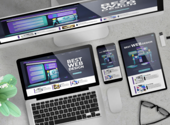
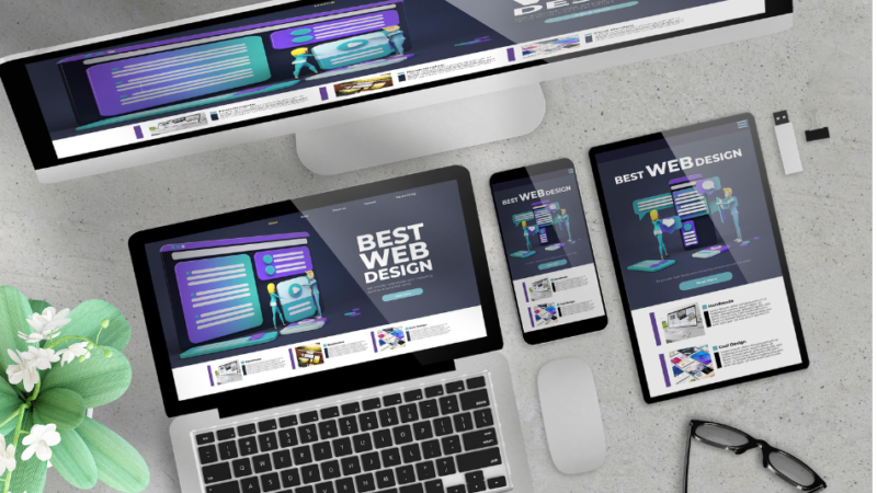
The Benefits of Responsive Web Design for Higher Rankings and Better User Experience
What is Responsive Web Design?
Responsive web design is an approach to web design aimed at making web pages render well on a variety of devices and window or screen sizes. With responsive design, the layout of a website automatically adjusts to the size of the screen it’s being viewed on—whether that’s a large desktop monitor, a tablet, or a mobile phone.
1. Enhanced User Experience (UX)
The core of responsive web design is to provide a smooth and consistent experience for users, no matter what device they use.
Mobile-First Approach: With more users accessing websites on mobile devices, responsive design ensures your website functions just as well on a phone as it does on a desktop.
Easy Navigation: Responsive websites automatically adjust the layout, font sizes, and buttons based on the screen size, making it easier for users to interact with your content.
Faster Load Times: Mobile-friendly websites with optimized images and content load quicker, reducing the chances of visitors leaving before the page fully loads.
Providing a seamless experience increases user engagement, encourages visitors to explore more pages, and leads to a better overall experience.
2. Boosted SEO Performance
Google and other search engines prioritize websites that offer an excellent user experience, and responsive design plays a major role in this.
Mobile-First Indexing: Google’s algorithm primarily uses the mobile version of your website to rank and index pages. A responsive site ensures consistency in your content across devices, improving your SEO.
Single URL for All Devices: With responsive design, your website has one URL for all devices, which simplifies the crawling and indexing process for search engines. This reduces the risk of duplicate content and improves SEO.
Improved User Metrics: Search engines like Google factor in user experience signals such as bounce rates, session duration, and engagement. A responsive site encourages visitors to stay longer, reducing bounce rates and improving these metrics, which can positively impact rankings.
Responsive web design is a direct way to signal to search engines that your site is mobile-friendly and provides a great experience to users.
3. Higher Mobile Traffic and Conversions
With the rise of mobile internet usage, it’s no surprise that mobile-friendly websites see a higher volume of traffic. Responsive design ensures that your site is optimized for the mobile experience, which can lead to:
More Mobile Users: A responsive site adapts to any screen size, ensuring that mobile users are not left with a poor experience. More mobile users will visit your site if it’s easy to navigate and quick to load.
Increased Conversions: Since mobile users can navigate your site easily and complete purchases or sign-ups without issues, responsive design often leads to higher conversion rates on mobile devices.
By catering to mobile users, you ensure that you’re tapping into the growing segment of mobile traffic and improving your chances of converting that traffic into leads or sales.
4. Cost-Effectiveness and Maintenance Efficiency
Traditional websites required separate versions for desktop and mobile, leading to increased development and maintenance costs. With responsive design, all users—on any device—are served the same version of the site. This brings several financial and operational benefits:
One Website for All Devices: You don’t need to build and maintain multiple websites for different devices. A single responsive website eliminates the need for a separate mobile site.
Simplified Updates: Since the site is unified, any changes or updates to content, design, or features only need to be applied once, rather than across multiple versions.
Consolidated Analytics: With responsive design, you track all your traffic in one place, streamlining analytics and improving decision-making.
This unified approach saves both time and money, making it a more cost-effective choice for businesses looking to optimize their online presence.
5. Future-Proofing Your Website
As new devices with varying screen sizes are continuously released, responsive design ensures that your website can easily adapt to these changes without the need for constant redesigns. This makes your website:
Adaptable to New Devices: Whether it’s a smartwatch, tablet, or the next big device, a responsive site automatically adjusts to fit, making it future-proof.
Scalable: Responsive websites are built with scalability in mind, meaning as technology evolves, your website can grow without needing a major overhaul.
By using responsive web design, you invest in a website that will continue to perform well across future devices and technologies, saving you time and effort in the long run.
6. Better Social Sharing and Referral Traffic
A website that works well across all devices is more likely to be shared on social media and linked to by other websites. Here’s how responsive design impacts social sharing:
Consistent Design Across Platforms: Whether shared on Facebook, Twitter, or Instagram, your content will look great and function properly on mobile devices, making it more likely to be shared by users.
Higher Referral Traffic: Users who share your content on mobile platforms are more likely to click through and engage with your website, driving traffic and potentially increasing conversions.
The more shareable and accessible your website is, the more likely it is to benefit from organic referral traffic, expanding your reach and growing your audience.
7. Improved Analytics and Insights
With a single, unified website, analytics and tracking become simpler. You can easily track user behaviour, conversions, and other key performance indicators (KPIs) across all devices. Key benefits include:
One Set of Data: Responsive design consolidates your traffic data, making it easier to monitor user behaviour and site performance.
Better Decision-Making: With accurate, consolidated data, you can make informed decisions about your marketing and content strategies, ultimately improving your website’s effectiveness.
Contact
Contact With Me
Amritansh Ranjan
Senior Full Stack Developer
I am available for freelance work. Connect with me via and call in to my account.


